

Frequency Distribution: Tables, Charts, and Hidden Tails
A frequency distribution is a table or chart that groups observations by value or range and shows how often each group occurs. Counts, shares, and cumulative totals answer different questions. A mean can hide a long tail.

A frequency distribution is a table or chart that groups observations by value or range and shows how often each group occurs. It is how you see concentration, spread, skew, and unusual clusters. Marketers use it for ad exposure, order counts, session length, and lead scores. It does not, by itself, say why a pattern happened.
Read it next to behavioral analytics when the observations are events, and next to an analytics dashboard when the chart will be reused. Reporting and analysis is the place the table should change a budget or a creative cap.
Build the table before the chart
NIST’s Engineering Statistics Handbook histogram chapter is the definitional source used here. Split the range into classes (bins), count the points in each class, then optionally convert those counts to proportions or running totals.
| Column | Meaning | Check |
|---|---|---|
| Value or bin | A single number (ungrouped) or an interval with written edges (grouped) | Edges do not overlap. Every observation has a home. |
| Frequency (count) | Observations in that bin | Sum of counts = number of observations, after you decide how to treat missing values |
| Relative frequency | Count / N | Shares sum to 1, or 100% |
| Cumulative frequency | Running count through that bin | Last row equals N |
| Cumulative relative | Running share | Last row equals 1, or 100% |
Ungrouped tables fit a small set of exact values: 1, 2, 3 exposures. Grouped tables fit continuous or wide data: order value in $50 bands. A histogram is the chart of those bins. NIST notes that bin width changes the picture: too wide hides modes, too narrow looks noisy. For a beginner comparison, use equal-width bins and report each bin’s share of observations. If widths differ, use density (count / (N x bin width)) so bar area, rather than bar height alone, represents relative frequency. Density is also the right normalization when overlaying a probability-density curve.
Denominator checks before you interpret:
- People versus impressions versus orders. Average frequency is impressions / people reached, not impressions / population.
- The window. Seven-day frequency is not 30-day frequency.
- Missing and excluded rows. Bots, staff IPs, and zero-order customers change N.
- Segment comparability. Use the same bin edges for new versus returning buyers.
A right skew has a long high tail. A left skew has a long low tail. NIST lists skew, outliers, and multiple modes as what a histogram is for. None of those shapes names a cause.
Worked example: order counts versus the mean
Hypothetical month of 100 customers and 250 orders. Illustrative, not a client result.
| Orders in the month | Customers (count) | Relative frequency | Cumulative customers | Orders from the bin | Share of orders |
|---|---|---|---|---|---|
| 1 | 60 | 60% | 60 | 60 | 24% |
| 2 | 25 | 25% | 85 | 50 | 20% |
| 4 | 10 | 10% | 95 | 40 | 16% |
| 20 | 5 | 5% | 100 | 100 | 40% |
| Total | 100 | 100% | 250 | 100% |
- Mean orders per customer = 250 / 100 = 2.5
- Median is 1 order because the 50th and 51st observations are both among the 60 one-time buyers
- Five customers (5%) produce 100 / 250 = 40% of orders
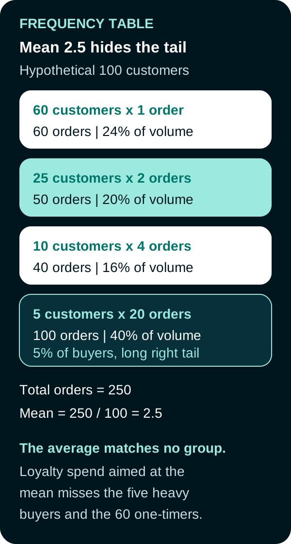
Hypothetical distribution. The mean is 2.5. Most customers ordered once. The tail produced 40% of volume.
A loyalty email written for the “average 2.5-order customer” matches almost nobody. Likewise, an uncapped campaign reporting an average frequency of 2.5 can still hide a small group at 20-plus exposures. That average is different from a correctly enforced hard cap, which is an integer limit within a defined time window and identity scope. Ask for the distribution and the cap scope, not only the average.
The table still does not tell you whether the five heavy buyers would have bought without a campaign. That is an incrementality question.

How to read the chart in practice
- Write the question: who is over-exposed, who never repeats, where do order values pile up?
- Fix N and the window.
- Choose ungrouped values or grouped bins that a colleague could rebuild.
- Report count and share. Add cumulative share if the decision is “how much volume sits below X.”
- Compare the mean, median, and the top bin’s share of the total.
- Only then attach a hypothesis (creative fatigue, VIP demand, bot traffic) and a test.
Frequently Asked Questions
What is a frequency distribution?
A frequency distribution is a table or chart that groups observations by a value or a range (a bin) and reports how often each group occurs. It can show counts, proportions, or running totals. It describes shape. It does not identify a cause.
What is the difference between count, relative frequency, and cumulative frequency?
Count is how many observations fall in the bin. Relative frequency is that count divided by the total number of observations. Cumulative frequency is the running total through that bin. Use the same total and the same bin edges when you compare segments.
Why can the mean mislead on marketing data?
The mean is total divided by the number of people or orders in the denominator. A few heavy buyers or heavily exposed households can pull the mean up while most people sit in a low bin. Read the table, not only the average.
How should bins be chosen?
Choose bins that match the decision: integer values when there are few distinct counts, equal-width ranges when the variable is continuous or wide. Write the edges so another analyst could rebuild the table. Do not move edges after seeing which story looks better.
Sources
PUT THIS KNOWLEDGE TO WORK
NEED MORE HELP?
Talk with our team about applying Frequency Distribution to your marketing.
Get a free marketing audit call